Senso is an organic coffee shop located in the vibrant city of Milan, where quality and ethical products take center stage.
Rooted in values that prioritize both people and the planet, Senso's identity is reflected in its name-meaning "meaningful" in Italian.
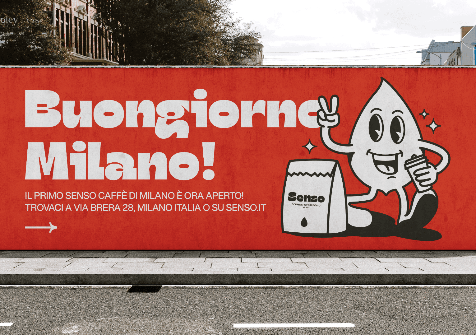
Designing the brand identity, packaging, and communication for Senso presented the challenge of balancing sustainability, ethics, and Milan’s dynamic energy. The brand needed to reflect its commitment to quality and respect for people and the planet while standing out in a competitive urban coffee scene. The choice of orange as the main color broke away from the expected green, infusing warmth and vibrancy that mirrors Milan’s lively atmosphere. The logo, a stylized leaf, had to embody both nature and the artistic swirls found in coffee, reinforcing Senso’s meaningful approach. Ensuring consistency across digital platforms, packaging, and in-store visuals required a cohesive design strategy that captured Senso’s essence: an organic, ethical, and contemporary coffee experience.
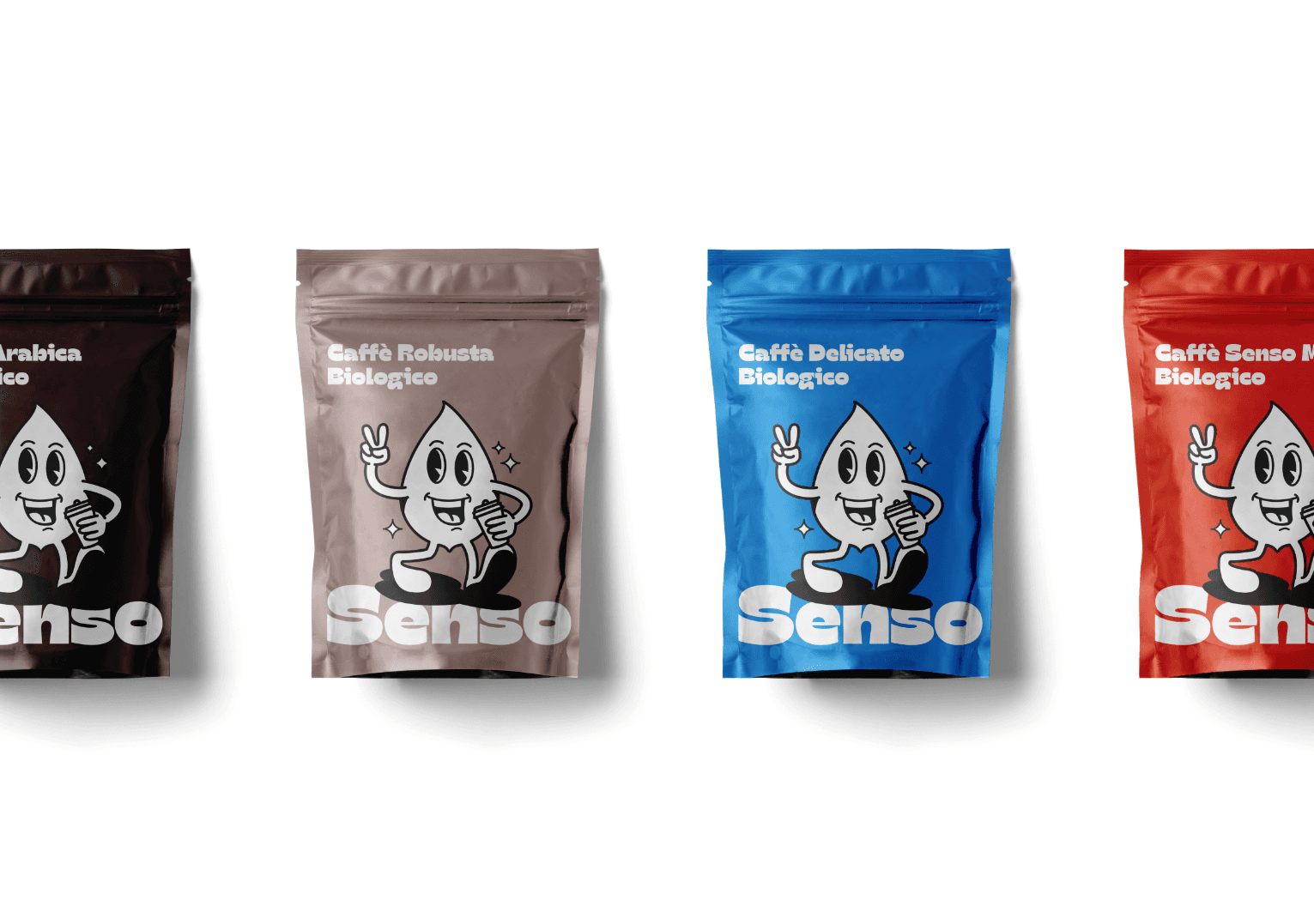
The logo features a delicate and minimalist leaf, symbolizing both nature and the gentle swirl seen in a coffee mug, reminding customers of the connection between their cup of coffee and the world around them. The use of orange as the primary color mirrors the energy and liveliness of Milan, offering a fresh take on sustainability without relying on the more conventional green.
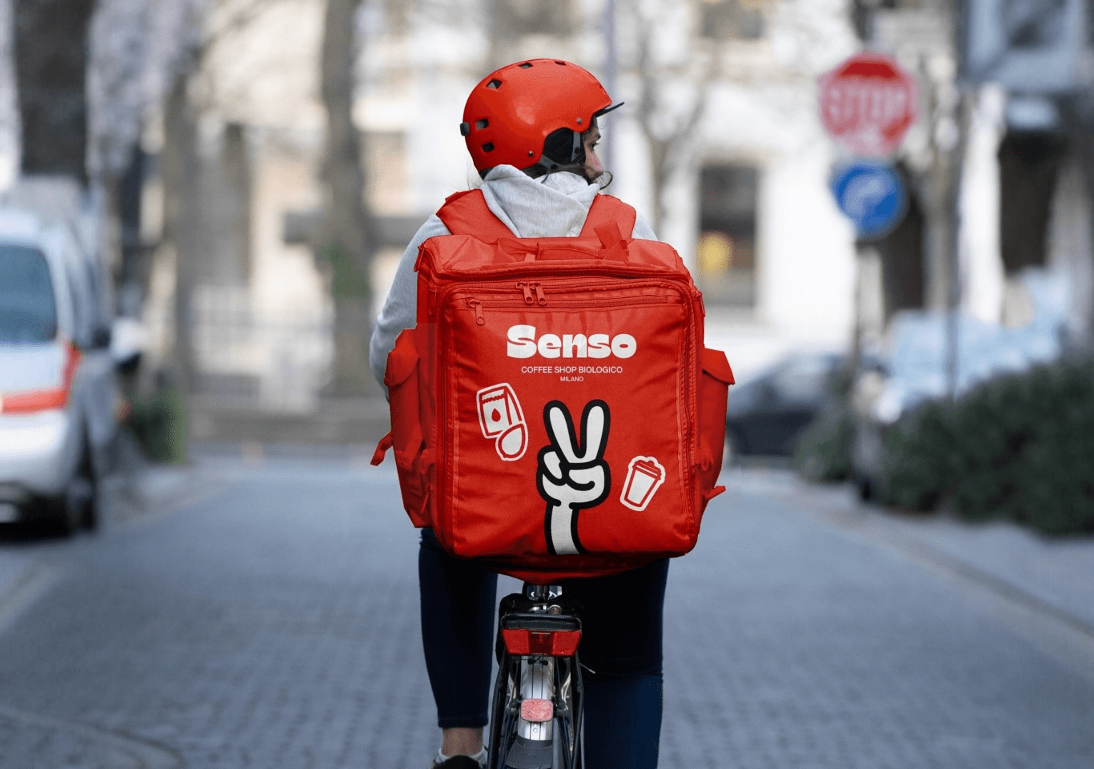
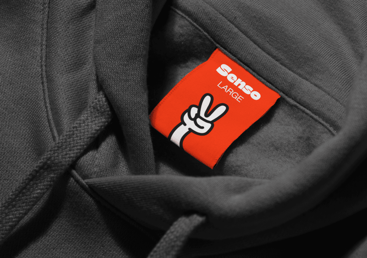
Senso’s brand communication and packaging are thoughtfully designed to create a cohesive and memorable identity across all platforms. From print materials and social media to product packaging, every touchpoint reflects the brand’s vibrant energy and eco-conscious values. The lively leaf character and minimalist design elements are consistently applied, ensuring a unified aesthetic that connects with customers. Senso’s packaging, featuring its iconic orange and minimalist leaf motif, reinforces the brand’s commitment to sustainability and quality, making each cup of coffee a meaningful experience.
The character of the Senso brand embodies a lively and joyful leaf, mirroring the brand's iconic logo. This vibrant leaf is brought to life, radiating positivity as it makes a peace sign— a symbol of Senso's commitment to ethical and quality products that respect both people and the planet. The character not only reflects the brand's eco-conscious values but also captures the energetic spirit and rich coffee tradition of Milan. With its dynamic presence, the Senso character symbolizes the meaningful connection between nature and the bustling, vibrant life of the city.