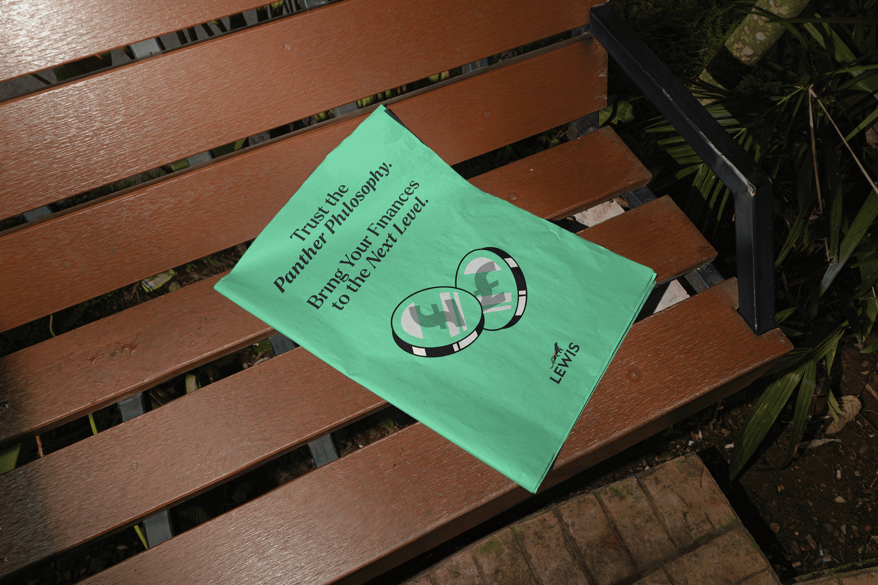
The rise of the Panther Philosophy
I crafted a design philosophy for the brand—‘The Panther Philosophy’—as a tribute to the original Lewis Black Panther, ensuring that every touchpoint reflects the unique spirit of Lewis. This philosophy goes beyond aesthetics; it’s about embedding the brand’s core values and emotional resonance into every interaction.
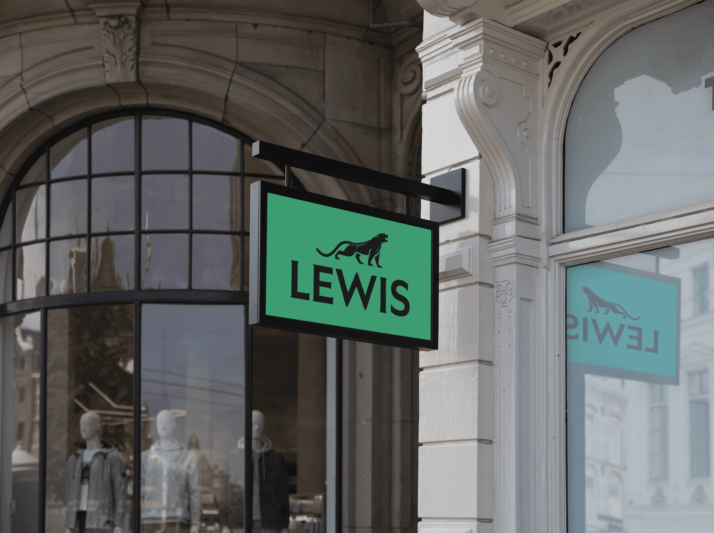
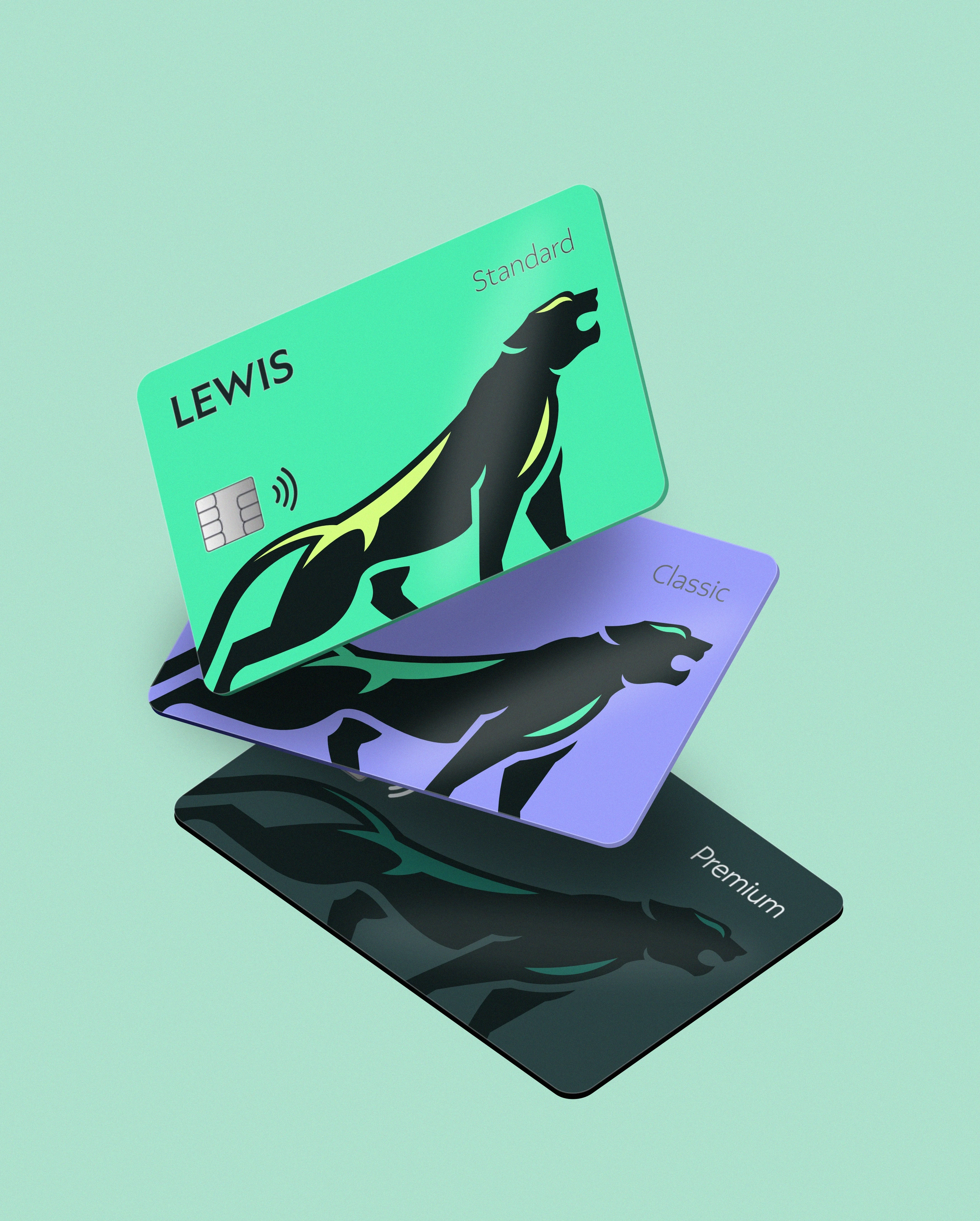
The visual identity blends two complementary typefaces inspired by early 20th-century British design, dynamically adapted through variations in weight and form. The colour palette has been refreshed, reclaiming the iconic Lewis green with renewed confidence, echoing the lushness of the British landscape. The updated tone of voice channels a grounded, authentic Britishness, while the new photography direction reflects today’s cultural landscape with clarity and relevance.
A brand bringing Lewis Bank to a new era.
The outcome is a distinctive and emotionally resonant brand identity rooted in The Panther Philosophy—a tribute to the original Lewis black panther. Every element, from typography inspired by early 20th-century British design to a refreshed colour palette and contemporary photography style, works together to create a cohesive brand experience that feels unmistakably Lewis: grounded, bold, and culturally relevant.